Overview
The purpose of a research poster is to convey the research's central problem and key findings. To be effective, the poster must be visually attractive. The goal is to create a poster that stands out from other posters and captures the audience's attention. In most cases, the audience will decide within seconds whether to read the poster. Therefore, the poster should include compelling visuals and clear, succinct prose that communicates effectively.
Below are recommendations for creating research posters for both Virginia Wesleyan's Port Day and off-campus academic conferences. These instructions are intended to be interdisciplinary, and thus, they might have to be modified for specific disciplines or projects.
Technical Considerations
- Program: Both paper and E-posters should be designed in POWERPOINT. A paper poster should be designed as a single PowerPoint slide. An E-poster may be 3 to 5 slides.
- Set-Up for Printed Posters: To be printed by VWU, posters must follow specific design parameters. The PAGE SET UP (located under DESIGN in PowerPoint) should be set as follows:
- Height= 24"
- Width= 36" to 48"
- Set-Up for E-posters:
- 40.97x23.04 (16:9 aspect ratio)
- You may include images, graphs, videos
Content
Content should be of high quality and follow professional and disciplinary standards.
Posters should include the following content sections:
- Project Title. The title should clearly communicate the project's purpose and significance. It should answer the first questions that a viewer might pose (e.g., research type and project's significance). While it's appropriate to incorporate disciplinary language into the title, viewers should be able to read the title and understand the problem that the research addresses.
- Information. Include the name(s) of the student(s), the course rubric and number, the course title, and instructor(s).
- Abstract. The abstract should provide a brief synopsis of the research. This summary should explain the research's main problem, its method, and its key findings. In some disciplines, the findings refer to the research's argument. In most disciplines, the abstract should be written out in full sentences (i.e., not bulleted).
- Introduction. This section should explain the specific questions that the research addresses and include a brief overview of the key literature in the field. The introduction might also lay out the particular research context and include a hypothesis.
- Method. This section should explain the method or approach the the research employed. It might note scholarly literature that provided a model for the research.
- Results. This section should explain the research’s main results. For qualitative studies, this might be the key arguments, interpretations, or conclusions. Quantitative studies might review key data analyzed in the research process. All data should have figure or table headings, depending on the format.
- Discussion. The discussion section should explain the most significant findings of the research. It might also suggest future areas of research based on these findings.
- Works Cited. This section should provide full citations for 3 to 6 key sources that the research incorporated. Citations should be formatted according to disciplinary conventions.
- Acknowledgements. Recognize the people who helped you, including the course instructor and mentors. Include full titles in the acknowledgements. In addition, acknowledge funding sources.
- Visuals. Incorporate visual aids to illustrate key points. Be sure to label all visuals. Include: names, dates, locations, photographers, and citations.
- VWU Logo. Recognize Virginia Wesleyan University as the institution where the research was conducted by including the VWU logo.
Recommendations for Text
The text should communicate ideas clearly and succinctly.
While the poster should include the above content items, it's also important to limit the amount of text, as few people will read a poster that contains a lot of text.
- Avoid long sentences.
- Use the active voice.
- Additional information may be distributed as a supplemental handout during the Port Day poster session.
Design
Posters should follow specific design parameters to make them visually interesting and effective. Here are some guidelines:
- Margins: Avoid putting content elements at the margins of the PowerPoint slide because these might get cut off in the printing process. In other words, leave large margins on the slide.
- Clearly Define Content Sections. Place key content is separate sections that are visually separated from other content sections. Each section should include a clear title that explains what the section does.
- Blank Spaces. Include ample blank spaces that set off content sections. If the poster contains too much content (especially text), the viewer might feel overwhelmed and thus be reluctant to read the poster.
- Poster Coherence. To enable the viewer to read the poster with relative ease and to understand the relationship between its sections, the poster should contain visual coherence. Specifically, related content sections should be visually aligned in such a manner that they flow from one main point to the next. This provides a visual path for the audience to follow. Graphic hierarchy (e.g., larger to smaller font and color coding) also helps the viewer to interpret the project's significance quickly.
- Background Color: The background should be light colored (but not necessarily white). If you use other colors, make sure that the text is a contrasting color. Gradient coloring looks good. Avoid red for the background.
- Section Background Colors: Posters that include different background colors for sections/elements look good and help the audience to follow the content sections. However, the poster should not include too many competing colors.
- Background Images: In most cases, posters should not include background images, as they tend to compete with the content and make the poster look busy.
- Font Sizes: Posters should use a variety of font sizes to draw more/less attention to certain elements on the poster. The largest fonts should be reserved for the project's title and the section titles. The minimum setting for the font size is 24 point; however, the font sizes generally should be larger than 24 point.
- Font Color: The font color should be a contrasting color against the background color.
- Presentation of Text: Bullet most of the text to make information easy to read (although the abstract should be written out in complete sentences).
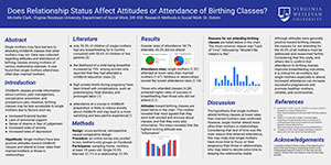
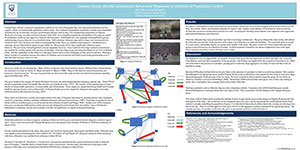
Samples


